A global project tracking platform for offshore oil & gas operations. Replaced Excel-driven workflows for executives, engineers, and field managers.
McDermott is a global engineering and construction company. Their offshore oil & gas projects span months and continents - Qatar to Mexico, Australia to the Gulf of Mexico. I was sole UX on a 1-PM / 4-engineer team building XD: a project tracking platform replacing fragmented Excel workflows for executives, engineers, and field managers. The project shipped globally and produced a 5× task speedup in usability testing. The instinct was to treat this as a business problem; the real lesson was that I'd left engineers out of the discovery and had to course-correct mid-project.
McDermott runs dozens of large engineering-and-construction projects concurrently - offshore platforms, subsea pipelines, onshore terminals - each staffed by hundreds of engineers and managed from regional offices. Before XD, project tracking lived in Excel: status reports emailed weekly, rolled up by hand, broken into regional sheets that diverged from each other by the time leadership reviewed them on Mondays.
Three very different people relied on that weekly ritual. Executives needed to see portfolio health at a glance - which projects were on track, which were slipping, which needed intervention. Engineers needed to report status without it eating into the engineering work they were actually paid to do. Field managers sat between those two, translating between the engineers' granular reality and the executives' portfolio view.
My brief from the PM was clear: replace Excel, give executives a dashboard, speed up the reporting cycle. The brief didn't mention engineers' workflow - and that turned out to matter.
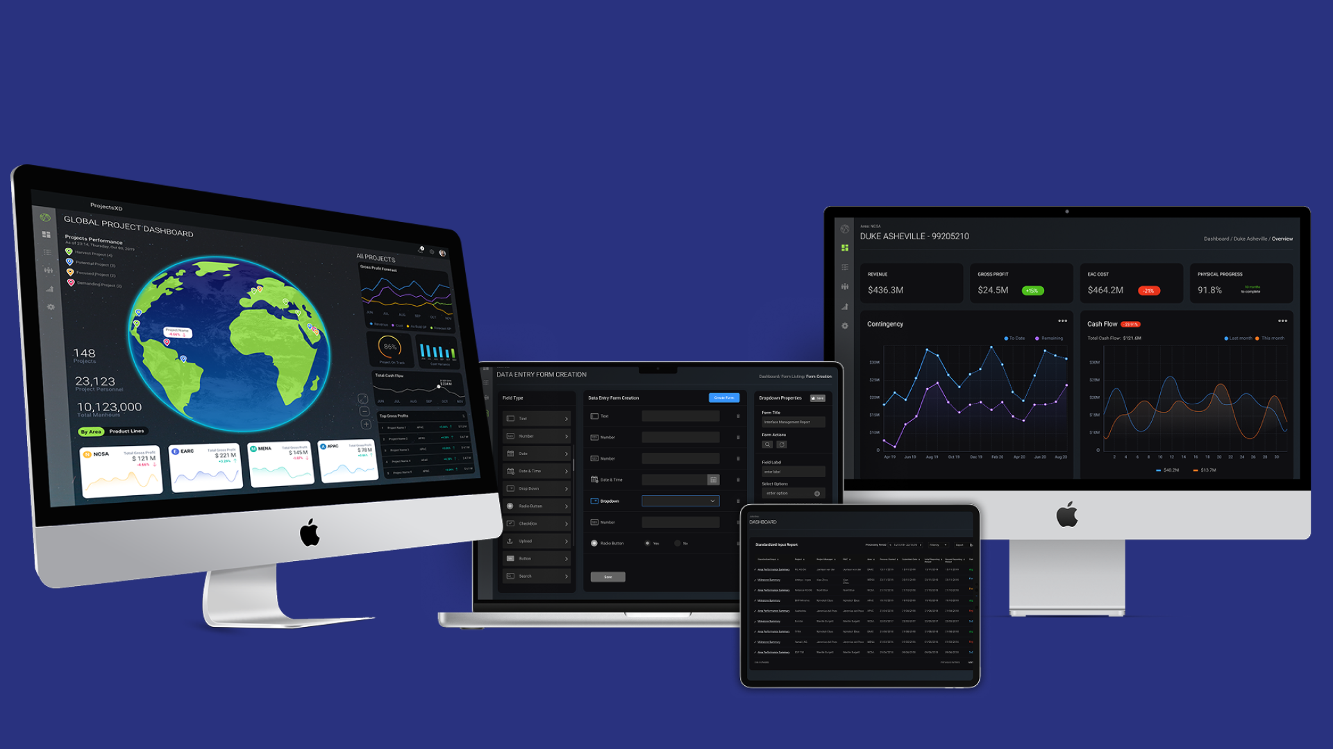
XD had three design decisions where a less experienced designer might have gone a different way. Two I made cleanly; one I got pushback on and ultimately made the harder call.
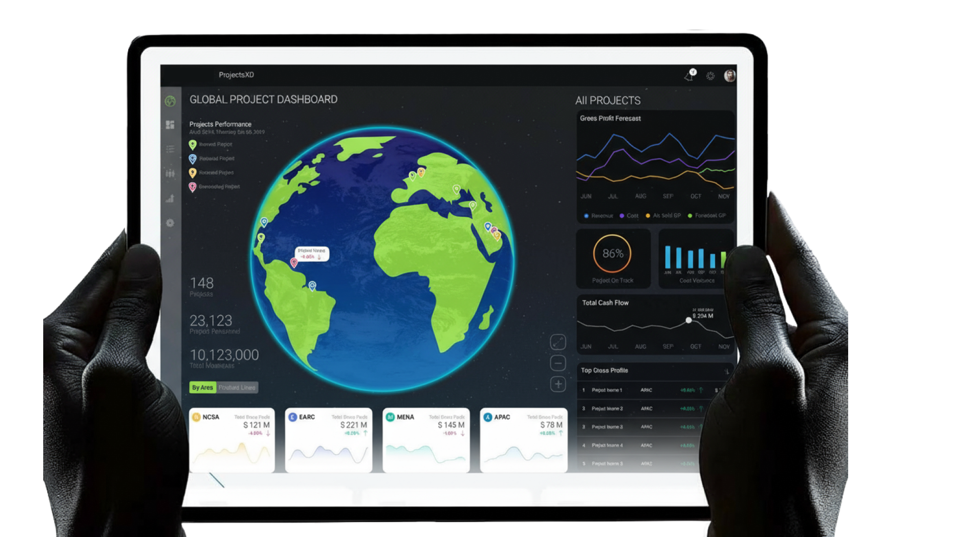
The obvious dashboard for portfolio health is a data table - rows of projects, columns of metrics, sort and filter. I designed a rotating globe instead, with projects represented as nodes sized by scale and colored by status. Executives could see the whole portfolio geographically at a glance - "that region is red, why?" - before drilling into any project's detail.
Pushback came from engineers ("this isn't a useful tool") and from a few managers ("a table would be faster"). But executives loved it precisely because it wasn't a table. Tables are for specialists. The globe was for busy people with twelve minutes between meetings.
Engineers needed to file status updates. The fastest path was to put Excel in the browser - familiar UI, zero retraining. I argued against it. If we replicated Excel, we'd replicate Excel's problems: free-form entry, inconsistent data across teams, no structured feedback to executives. I built template-driven status filing instead - structured fields, validated inputs, a clear weekly cadence.
This was the decision engineers pushed back on hardest. "I know Excel. I don't want to learn your templates." The resolution came from involving engineers in template design - they helped shape the templates so the templates matched how they actually thought about status, not how I thought they did.
The PM wanted engineers' status updates to flow through manager approval before reaching executives. "Data quality matters. Executives shouldn't see unreviewed numbers." My counter: approval gates slow the reporting cycle, which was the whole point of the product. I argued for unfiltered flow with a clear audit trail - every edit timestamped and attributed, every status change reviewable after the fact.
We went back and forth for two weeks. I won on data-integrity grounds: audit trails produce better discipline than approval gates, because engineers know their work is visible rather than hidden behind a manager's sign-off. The product shipped that way and it worked.
The clearest evidence of Decision 01 is what executives actually saw. Before XD, they saw a spreadsheet. After XD, they saw a rotating globe with portfolio health at a glance.

For the first six weeks of XD, I treated the project as a business problem. The brief was "replace Excel, speed up the reporting cycle." I anchored my discovery on executives and managers - the people whose pain was loudest and most visible.
Engineers got included late. When I finally ran engineer interviews - partly because the template design argument forced me to - I realized I'd misunderstood the product's core constraint. The bottleneck wasn't executive reporting; it was the fact that engineers were already overwhelmed, and a reporting tool that added friction would be sabotaged at the source. No executive dashboard works if engineers don't file.
The product recovered because I course-corrected - involving engineers in template design, weighting their feedback heavily, re-sequencing the build so their experience mattered as much as the executive view. But the six weeks I lost early are the clearest "what I'd do differently" on this project.