Work / ● Oracle · Current

ASAP

Moving Oracle's twenty-year-old service-activation platform onto Redwood, redesigned around the three people who use it every day.

Role
Sole UX Designer
Team
PM, engineering
Timeline
4-6 months
Platform
Desktop web · Redwood DS
Status
In engineering
The case at a glance
20yr
Legacy platform replaced
3personas
CSR · Admin · Manager, one shared data spine
4flows
Smart Search · Order Details · Dashboard · Guided Creation
TL;DR

ASAP - Automated Service Activation Platform - is Oracle Communications' provisioning engine, translating customer work orders into the commands that turn services on. For two decades the operator's window into ASAP has been OCA, a Java applet whose design vocabulary predates the web. Oracle's decision was a full redesign, not a reskin. I joined as the sole UX designer on a team that had never worked with a UX process before. The hardest work wasn't picking which screens to build - it was bringing the engineering team into a UX process they hadn't previously used, and earning the trust to drive IA and pattern decisions from that process.

01

The situation

OCA's landing page is an empty session log. Its search requires users to fill in ten or more technical fields. Fallouts surface as raw switch commands like SEND 'NEW $ 6742727 236 1 REM1...'. CSDL Information, Global Parameters, and Work Order Details each open as blank tabs with no guidance about what to do next. The UI is recognizably the product of twenty years of engineering-era feature additions, layered on a Java applet whose interaction vocabulary predates most of the web.
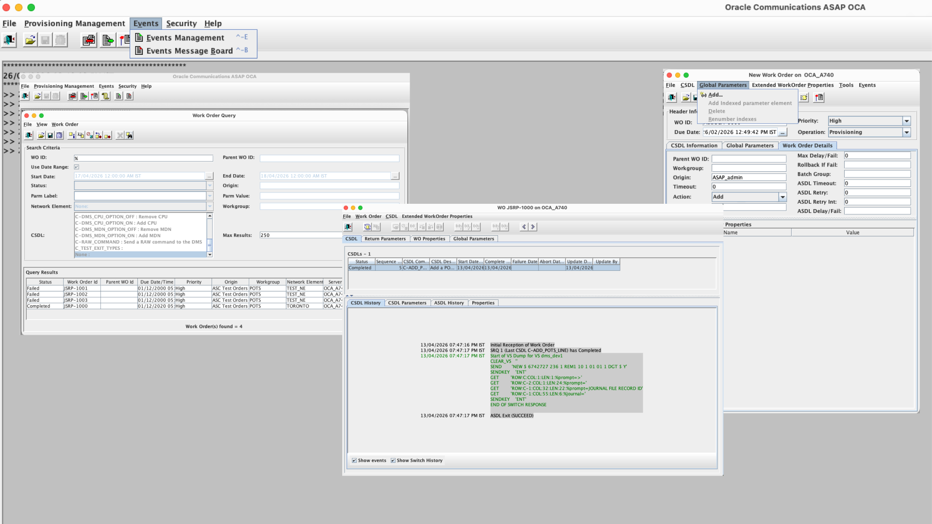
The Oracle Communications ASAP OCA legacy Java client - dense query windows and raw switch command logs
Fig. 01 · The OCA interface CSRs and Admins lived inside for two decades.

Three very different people rely on this tool every day. A Customer Service Representative answers a call about a delayed broadband activation and needs to say something truthful within thirty seconds. A combined Network Operations Engineer / Order Admin sits inside the system for hours, diagnosing fallouts, editing parameters, retrying CSDLs. An Operations Manager wants a single screen that tells her whether the activation business is healthy today. In OCA, all three see the same engineer-era UI.

The business driver for the rebuild is architectural: Redwood is where Oracle's product surface is heading, and two decades of accreted UI patterns need to be rethought from the user outward, not retrofitted.
All three users see the same engineer-era UI. The CSR has to learn CSDL vocabulary to answer a customer question.
From the situation
02

The decisions that mattered

ASAP is a solo UX project within its immediate team. My peer review happened externally at Oracle's quarterly Industry UX All-Hands. Inside the project, most calls below weren't argued against a competing UX position - they were calls I made because the team didn't have context to frame the tradeoffs, and then trusted the rationale once I made the reasoning visible.

Decision 01
One product that behaves like three, not three products.

Three personas, three very different jobs. The obvious-looking answer was to build three apps. I argued against it. Three apps would fragment one product into three, create downstream cost in engineering and training, and force the business to maintain three roadmaps against one data model. The answer I arrived at was one product with a shared data spine and three persona-specific surfaces on top - same work orders, same CSDL data, but three different first screens and three default views into the same truth.

Decision 02
Shape of Data as an explicit deliverable.

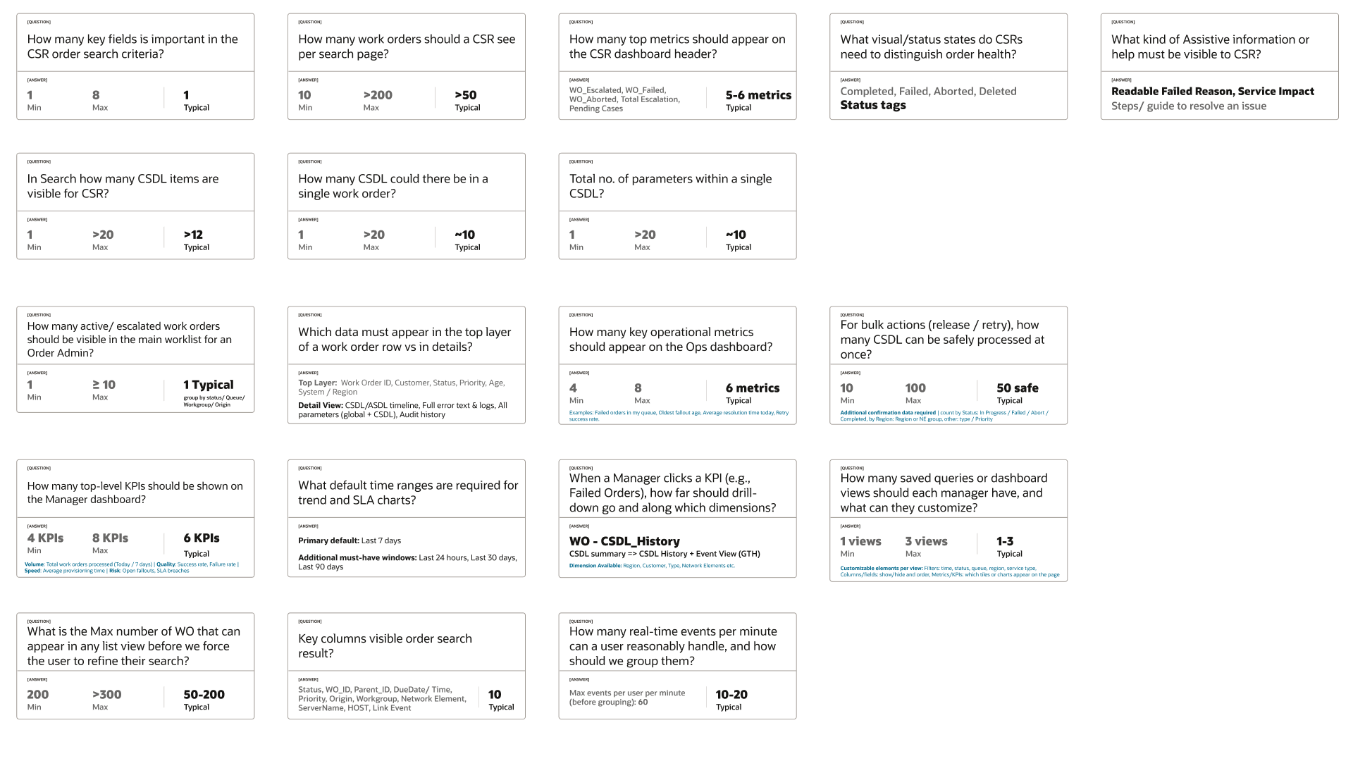
Most teams jump from personas to wireframes. I inserted a step in between. For each persona I wrote a question-and-answer document defining the quantitative shape of their screens: fields per card (5-7 for CSR), work orders per search page (20 typical, 200 cap), Admin worklist size before grouping (50 typical), Manager KPIs on a dashboard (4-8, grouped Volume/Quality/Speed/Risk), default time window for trends (7 days with 24h, 30d, 90d alternates), max events per minute before UI groups them (60).

These numbers determine whether a screen feels calm or chaotic. By making Shape of Data an explicit artifact, the team acquired shared vocabulary for density decisions. Engineering could build against the numbers; PM could scope with confidence.

The Shape of Data artifact - question-and-answer cards quantifying data volumes for each CSR and Admin surface
Fig. 02 · The persona Shape of Data reference, used as engineering handoff.
Decision 03
Success criteria benchmarked against OCA.

Three performance and three satisfaction criteria per persona, each with a benchmark from observed OCA behavior and a target for the new build. These are design hypotheses, not shipped metrics - but they force every subsequent decision to answer: does this move the benchmark?

Decision 04
Collapsing NOE and Order Admin into one persona.

An earlier persona set treated Network Operations Engineer and Order Admin as two separate people. Engineering - who had lived with this product for years - surfaced that in practice they are the same user with overlapping access and lifecycle responsibilities. The collapse simplified role-based access control and gave the user a single coherent surface. Design leadership on domain-heavy products depends on listening to the team that has lived inside the data for years.

Most teams jump from personas to wireframes. I inserted a step in between: Shape of Data.
Decision 02
03

Four signature design moves

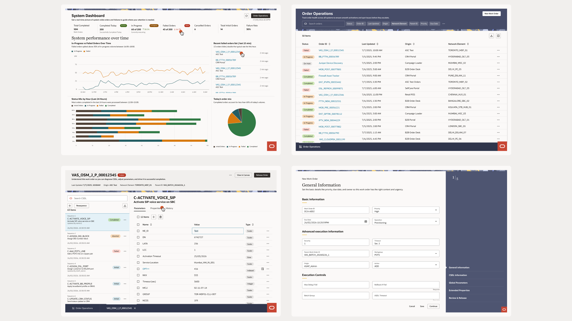
The IA rests on four principles: Stepwise Journey, Information Grouping, Guided Decision-Making, Operational Awareness. From those came four hi-fi design decisions.

01 · Smart Search
From ten fields to one.
Replaces OCA's ten-field dialog with a single input and chip-based filters. Users type what they know; the system offers refinements as chips.
02 · Unified Order Details
Scannable spine, contextual side panel.
Turns the CSDL list into a scannable spine with a contextual side panel - parameters, history, properties, impact - rather than scattered tabs.
03 · System Dashboard
A 24-hour pulse for the Admin.
Failed orders, oldest fallout age, retry success rate, SLA breach status. No Excel pivots required. One glance, one truth.
04 · Guided Order Creation
Five-step Redwood Guided Process.
Replaces the empty-tab New Work Order with: General Information, CSDL Information, Global Parameters, Extended Properties, Review and Release.
The four signature Redwood flows in high fidelity - system dashboard, order operations, work order detail and new work order
Fig. 03 · The four anchor flows, in hi-fi.
04

What I learned that changed how I designed

The engineering team had never worked with a UX process before ASAP. My job wasn't only to produce screens - it was to bring the team into a way of working that didn't previously exist inside the product. I ran collaborative working sessions where engineers and I walked through each persona's day. I introduced Redwood not just as a component library but as a shared language - conventions for guided processes, smart search, data tables, page shells that the team could build against confidently.

The co-ownership is what made the process hold. Because the team was inside the work from day one, internal alignment wasn't adversarial. Conversations focused on content feasibility rather than whether the IA was right. The team trusted UX to own those calls; my job was to earn that trust by making rationale visible at every step.

Primary goals, Shape of Data, Success Criteria, IA, wireframes, and hi-fis - built with the team in the room, not handed over a wall.
Design leadership on a UX-naive team
05

Validation

Validation happened in two loops. Internally, regular communication syncups with PM and engineering captured feedback and iterated on rationale. Externally, Oracle's quarterly Industry UX All-Hands - where designers across Oracle's industry portfolio reviewed the work - forced me to defend the Shape of Data numbers, the IA principles, and the four signature decisions to designers who hadn't been inside the project. Each round sharpened the rationale.

06

Status

Complete
Hi-fi prototype covering all four signature flows plus three persona-specific landing surfaces.
Complete
Reference document with goals, Shape of Data tables, and Success Criteria per persona, benchmarked against OCA.
Complete
As-is and future-state storyboards in panel format for each persona, with named signature moments.
In flight
Active engineering development with iterative content refinement.
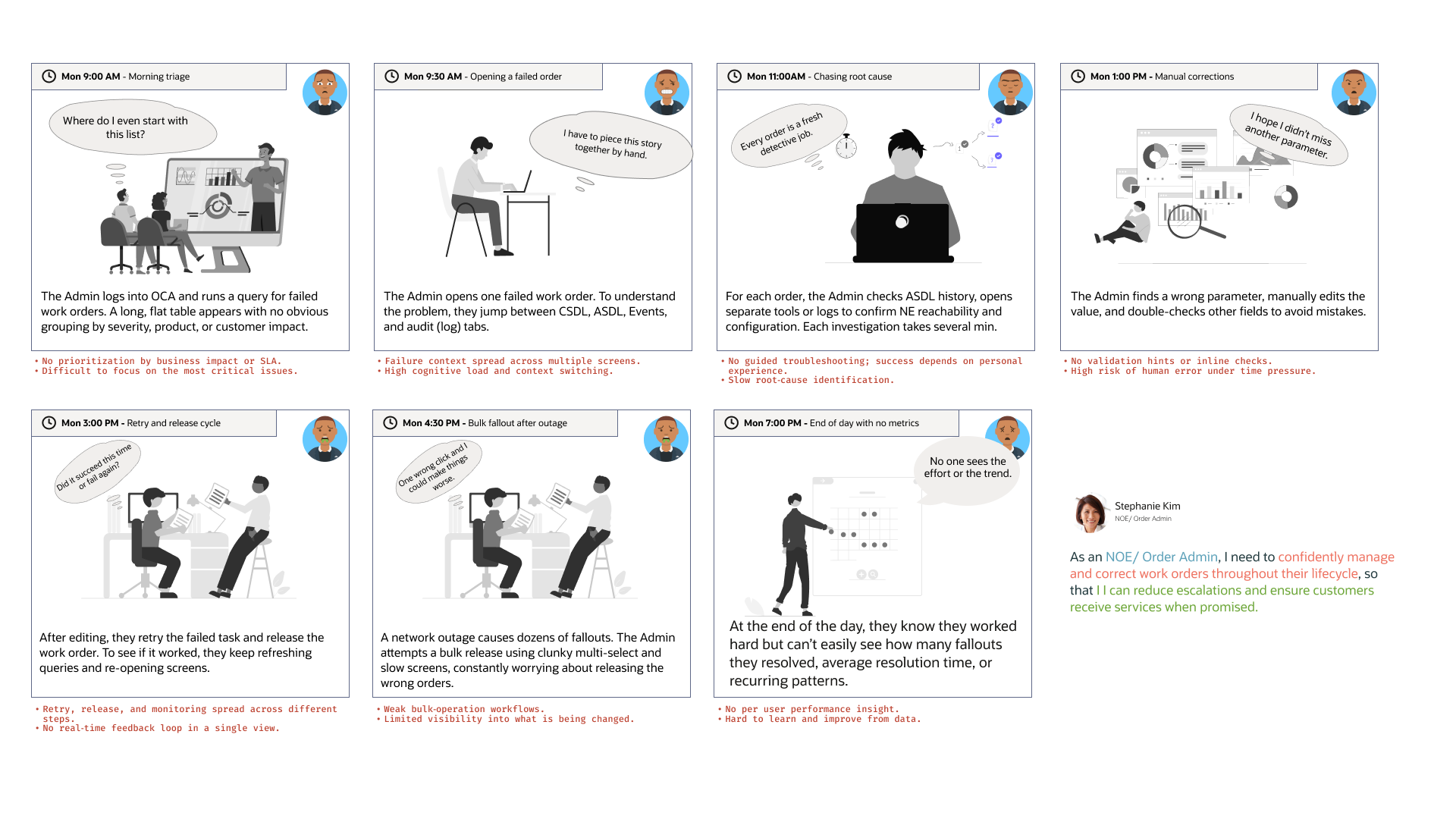
Persona storyboards and journey flow - the NOE/Order Admin day mapped from login through investigate and release
Fig. 04 · As-is and future-state storyboards for Frank, Stephanie, and Parker.
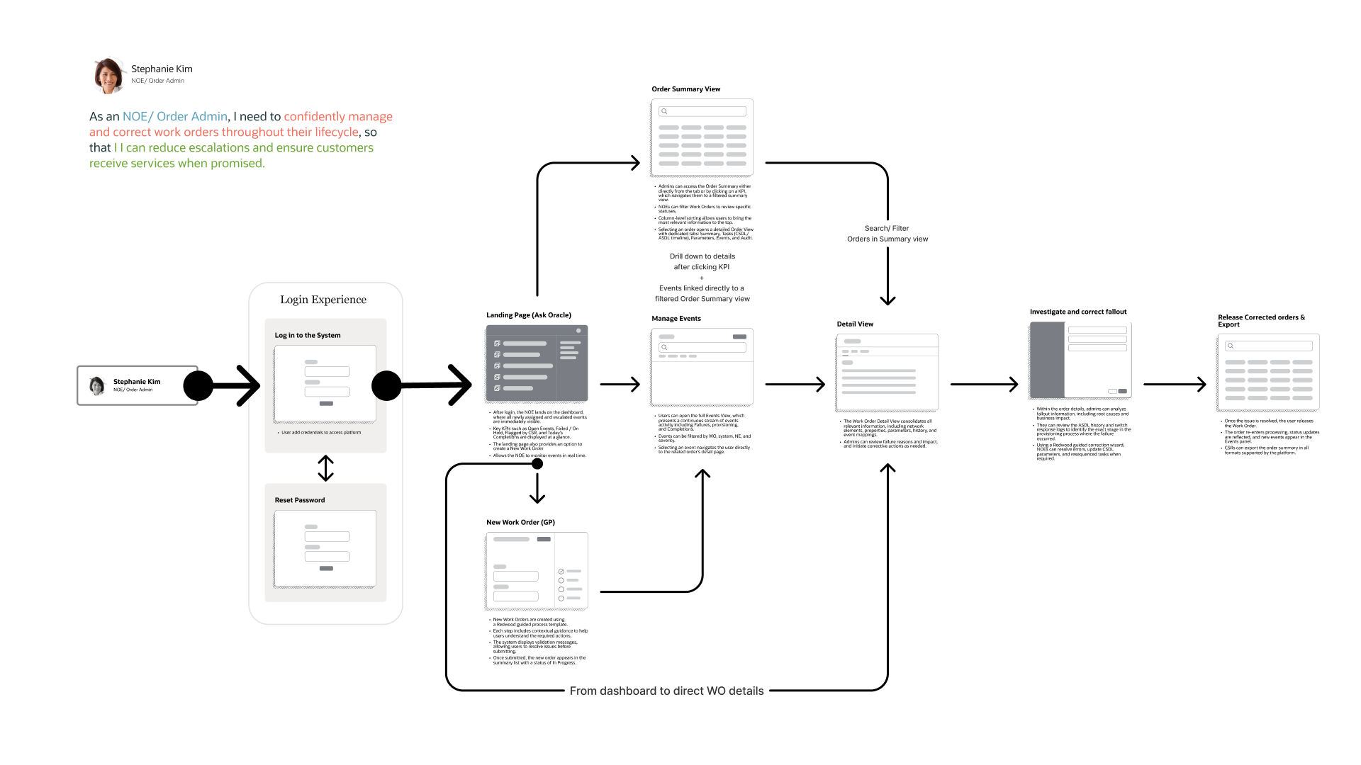
The end-to-end journey and information architecture for the Order Admin - login, Ask Oracle landing, order summary, detail view, investigate and release, with the navigation paths between them
Fig. 05 · The Order Admin's end-to-end journey - the flow that set the information architecture and navigation model, from Ask Oracle landing through investigate and release.
07

What the design is targeting

Design hypotheses grounded in observed OCA behavior, not measured outcomes. They become real metrics when the build reaches customers.

CSR · Frank Thomas
Time to find the correct work order
90-120 sec
30 sec
Time to answer "what's the status"
2-3 min
1 min
First-contact resolution
40-50%
70-80%
Admin · Stephanie Kim
Diagnosis time per fallout
10-15 min
5 min
Correction-and-release cycle
15-20 min
5-10 min
First-retry success rate
60-65%
80-85%
Manager · Parker Gauthier
Health-check time
20-30 min
< 5 min
Spike investigation
1-2 hr
15-20 min
Reporting cycle effort
2-3 hr
< 30 min
08

What I'd change

Structured user testing with real users, earlier.
The Success Criteria benchmarks are drawn from observing OCA behavior and interviewing engineering. That's defensible but indirect. Moderated testing with actual CSRs, Admins, and Managers would have tightened the density and hierarchy decisions on the Admin worklist in particular, and given direct evidence for the Manager dashboard's 7-day default window.
More time with downstream product teams.
ASAP sits between upstream order-capture and the network. The product lives in an ecosystem I didn't fully map at the start - OSM, UIM, CRM upstream, the switch fabric downstream. Understanding where design decisions cascade into adjacent systems would have caught a few interaction assumptions I had to revisit mid-project.
Next case study →