A learning platform that brought parents, teachers, and students onto one shared surface - projected onto the classroom wall.
Kexplora was my first founding-designer role. I joined Conexstra as its seventh employee in late 2014, designed the product and its brand, and shipped a classroom learning platform that brought parents, teachers, and students onto a shared surface. The company made NDTV's Top 20 Hottest Startups in India list in 2015. This case study is really about what beta-testing with three MBA colleges taught me - including one decision I'm still proud of a decade later, where the right fix for a design problem wasn't a design fix at all.
Conexstra was a Pune-based EdTech startup founded on a specific bet: that classrooms in India were missing a shared digital surface. Teachers had whiteboards. Students had notebooks. Parents had report cards. None of those three audiences could see what the other two were doing in real time.
Kexplora was the product. A classroom app projected onto the wall, mirrored on students' phones at home, surfaced to parents through a parent portal. Teachers prepared lessons on the app; the app pushed those lessons to students' phones for review; parents saw what was being taught and how their child was engaging. One product, three audiences, one shared context - the classroom itself.
I joined as employee number seven - brought in as the founding designer to build the product and the brand from scratch.
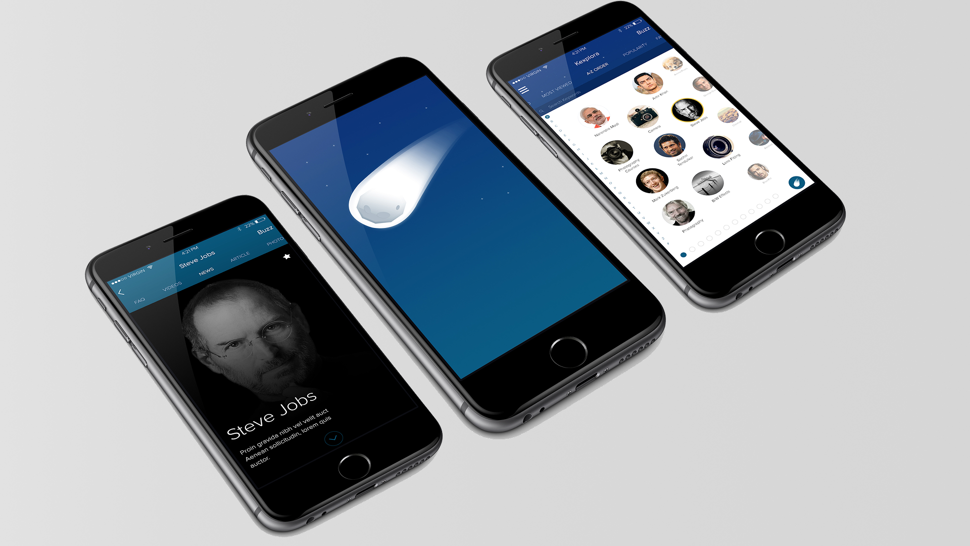
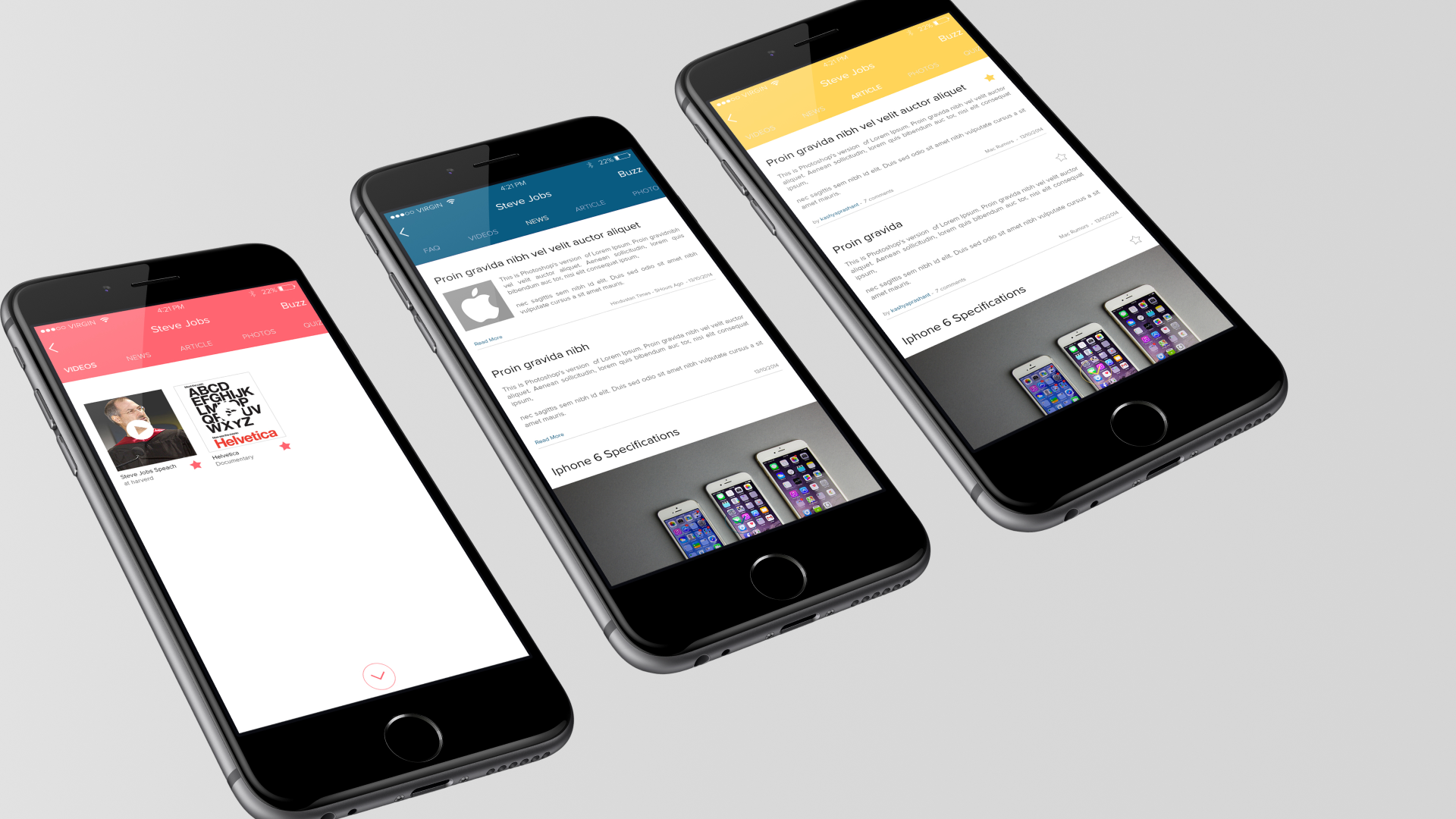
From joining the company to launch, I did almost everything a designer in a 7-person startup does: brand, product, marketing site, investor pitch decks, beta testing. Here's the shape of those six months.
We ran beta testing with three MBA colleges in early 2015. Three things came out of that beta that changed the shape of the product - and one of them changed how I think about design work a decade later.
We built Kexplora iOS-first because the team defaulted to iOS in Bengaluru and Mumbai - that's what the founder team used, that's what the CEO carried, that's what designers around us owned. When we put the app in MBA students' hands in our Pune beta, most of them had Android phones. Not iPhones.
I pivoted. The second release reshuffled platform priorities - Android-first for student-facing surfaces, iOS and web for teacher and parent surfaces where the device mix was different. The lesson wasn't "validate device assumptions." The lesson was "the founder's phone is not your user's phone."
Inside a topic - say, a chapter on photosynthesis - we had a persistent app bar at the top of the screen with navigation back to home, the user profile, notifications. Students in beta told us this felt heavy. They wanted to focus on the content, not on the app wrapping the content.
I removed the app bar entirely from the topic view. You entered a topic, you were in it - no chrome, no navigation clutter. The back button and navigation returned when you exited the topic. This small decision shaped the entire product's visual voice: classroom content should feel like content, not like an app interrupting content.
The biggest single problem we found in beta: teachers weren't entering lesson content into Kexplora. Which meant classrooms projected empty app surfaces. Which meant the product failed at its central premise.
The obvious design move was to simplify content entry - reduce steps, improve the editor, add templates. I tried that. It didn't move the needle. Teachers weren't bottlenecked by the UX of content entry; they were bottlenecked by the time available to them between classes.
The fix, in the end, was organizational. We recruited students from the MBA focus group to enter content on behalf of teachers - basic assistants who'd digitize teacher notes after lessons. Teachers approved; students assisted; the classroom surface populated. This worked.
The lesson I took from this - and still carry - is that not every design problem has a design solution. Sometimes the real answer is a process change, or an organizational change, or a staffing change. Recognizing which kind of problem you actually have is the first piece of design leadership.
Kexplora shipped. The beta work at three MBA colleges produced enough traction for Conexstra to be featured among NDTV's Top 20 Hottest Startups in India in 2015 - an editorial recognition that came with national visibility and helped us close a seed round.
